Mid-Atlantic Opioid Task Force
Goal
Utilize univariate time series approach in order to forecast the number of Opioid overdose incidents on the county level. Univariate time series approach uses previous values to predict future values, thus adjusting to trends and seasonality presented in the data.
Dataset
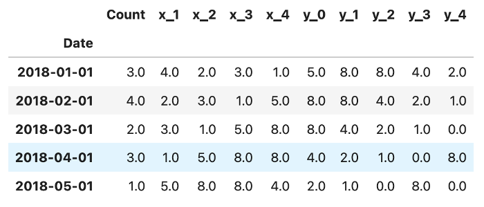
The index is a timestamp representating the first day of the month starting at 2018 up to the end of 2022. Each row contains the current count of overdose events, the next month's count (x_1), and so on till x_4 (lag of 5). Same apply for targets, each row contains 5 targets (y_0 to y_4) where y_0 is the month that comes after x_4:
Pseudo-code
- Create lags as features and targets (previous counts and target counts)
- Convert month and year features to datetime index as drop them.
- While desired date is not reached
- If not first iteration:
- Append a new row whom index is the next month datetime object.
- Left shift all values to the left, and set last column (y_4) to NaN (to be predicted)
- Split data
- Initialize estimator.
- Fit & predict.
- Set y_4 to the predicted value.
- Increase iteration’s index variable
- Calculate RMSE
- Plot input + forecast
- Plot Seasonal Decomposition
Performance
Performance evaluation was executed using both RMSE calculation and a graph showing the input, test and forecast. The graph was created using matplotlib packages, and ipywidgets package was utilized in order to provide a convenient way to explore different counties, as well as hyper parameter tuning. Ipywidgets is a python package to create widgets such as button, dropdowns and sliders and together with matplotlib the below grah was created:
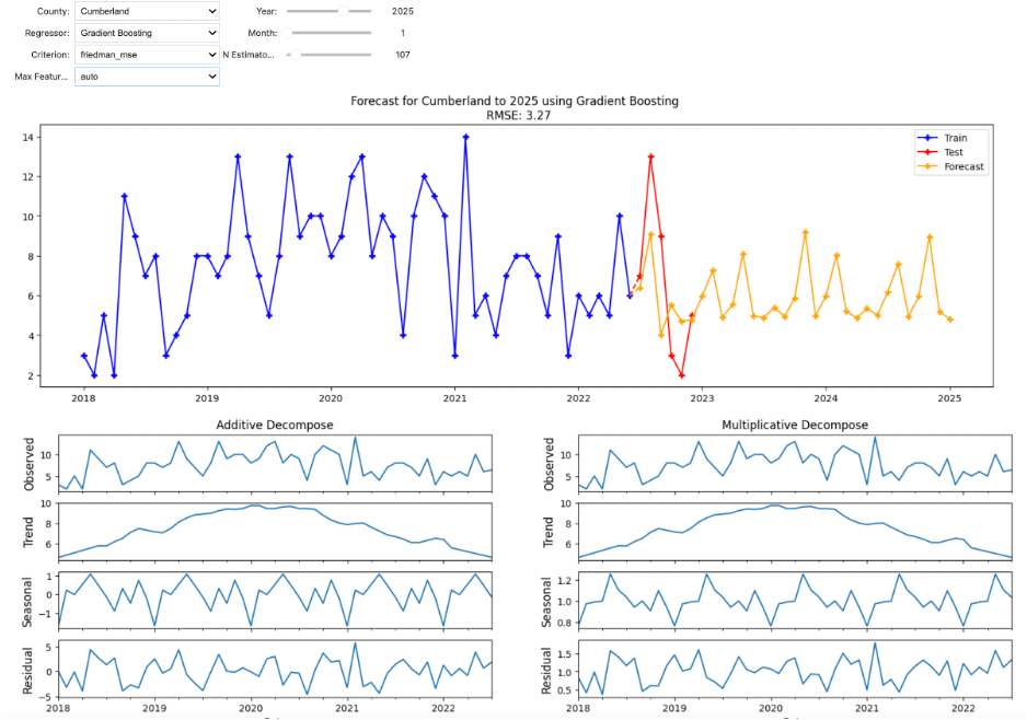
In the figure above, there are a few dropdowns (County, Regressor, Criterion, Max Features), and three sliders (Year, Month and N Estimators). Every time a value is changed, the new model will be trained on the input data for the corresponding County, and forecast up to the desired date (year and month). For instance, the above example shows a forecast with Gradient Boosting regressor, on Cumberland County, up to January 2025.
The bottom graphs show time-series decomposition process. The top graph is the time-series itself, second is the trend, or the tendency of the data, third graph shows seasonality, or the frequency presented in the data, and the bottom is called residual, which is the noise. It should be random, otherwise there is more information to be explored in the time-series.